How WhatsApp convinces you to give it your contacts
The Internet is currently ablaze with the news that WhatsApp will soon be requiring more user data to be shared with Facebook. This reminded me of another nefarious thing WhatsApp does that I haven’t seen anyone else talking about:
WhatsApp uses dark patterns to coerce you into giving it access to your contacts
While WhatsApp will work without access to your contacts, the user experience is deliberately degraded. Without access to your contacts, WhatsApp prominently displays each participant’s phone number above their message, with their display name shown next to it, almost as an afterthought:

The name is very low contrast compared to the background, where as the phone number is listed first, in larger text, and a high contrast colour. Your eye is immediately drawn to the phone number, making it hard to see at a glance who’s talking. The display name will also be truncated if it’s too long for the available space.
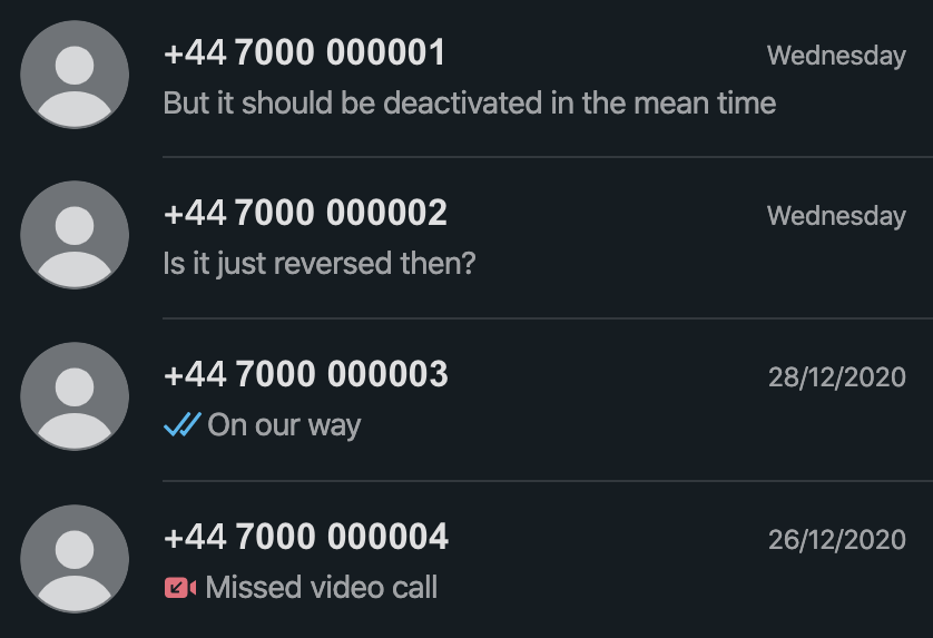
Even worse is the list of chats, which only displays the phone number for non-group chats, no names in sight:

You do at least get the user’s profile picture here, but not everyone adds a profile picture, and even if they do, they may choose one that is not easily recognisable.
There’s no good reason for WhatsApp to treat privacy conscious users this way. The name field is required when setting up a WhatsApp account, so every user has a name that could be displayed here instead of just the phone number.
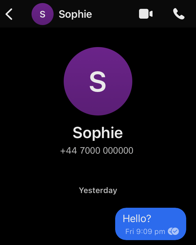
While writing this, I decided to install Signal, to see how it handles labeling chats without phonebook access. I wasn’t surprised to learn Signal choses the user friendly and logical option - displaying the participant’s name, with the phone number below it in smaller text:

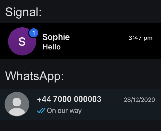
Signal also helps distinguish between chats with users who haven’t added a profile image, by generating a uniquely coloured circle containing their initial. This isn’t unique to Signal, or even a new idea, it’s a tried and tested pattern. Compared with WhatsApp’s “generic bust”, it presents further evidence that WhatsApp is made deliberately hard to use if you don’t give it access to your contacts:

When I first installed WhatsApp I didn’t give it access to my contacts, as I tend to err on the side of minimal permissions, and I couldn’t see why it would need access. However, it didn’t take long for me to become frustrated with this user experience. I was constantly struggling to find conversations, or identify who was talking in group chats.
I asked a friend with more WhatsApp experience if there was a way to make it show names instead of phone numbers. Their response was “Oh, that’s easy. You just need to give it access to your contacts.” This wasn’t the solution I was hoping for, and I resisted for as long as possible. Yet eventually the dark pattern wore me down, and I granted WhatsApp access to my contacts.
I joined WhatsApp in late 2014, at which point they’d already been acquired by Facebook. I find myself wondering if this was a preexisting pattern, or something that happened after the acquisition, possibly at the behest of Facebook.
Using display names as the primary identifier would be a vastly improved experience for those who chose not to give WhatsApp access to their contacts. Instead WhatsApp provides this unnecessarily worse experience, in an attempt to gain access to user’s contacts. And it works.
I’d love to be able to say that I’ll be replacing WhatsApp with an alternative like Signal, but WhatsApp’s network effect is a strong one, and it’s currently how I keep in touch with my family.
– Matt